Mountain Lily Studios
Interior design studio website built in WordPress with a custom theme, flexible ACF content sections, and polished responsive layouts to showcase curated spaces, project photography, and design work focused on connection, wellbeing, and community.
About the Client
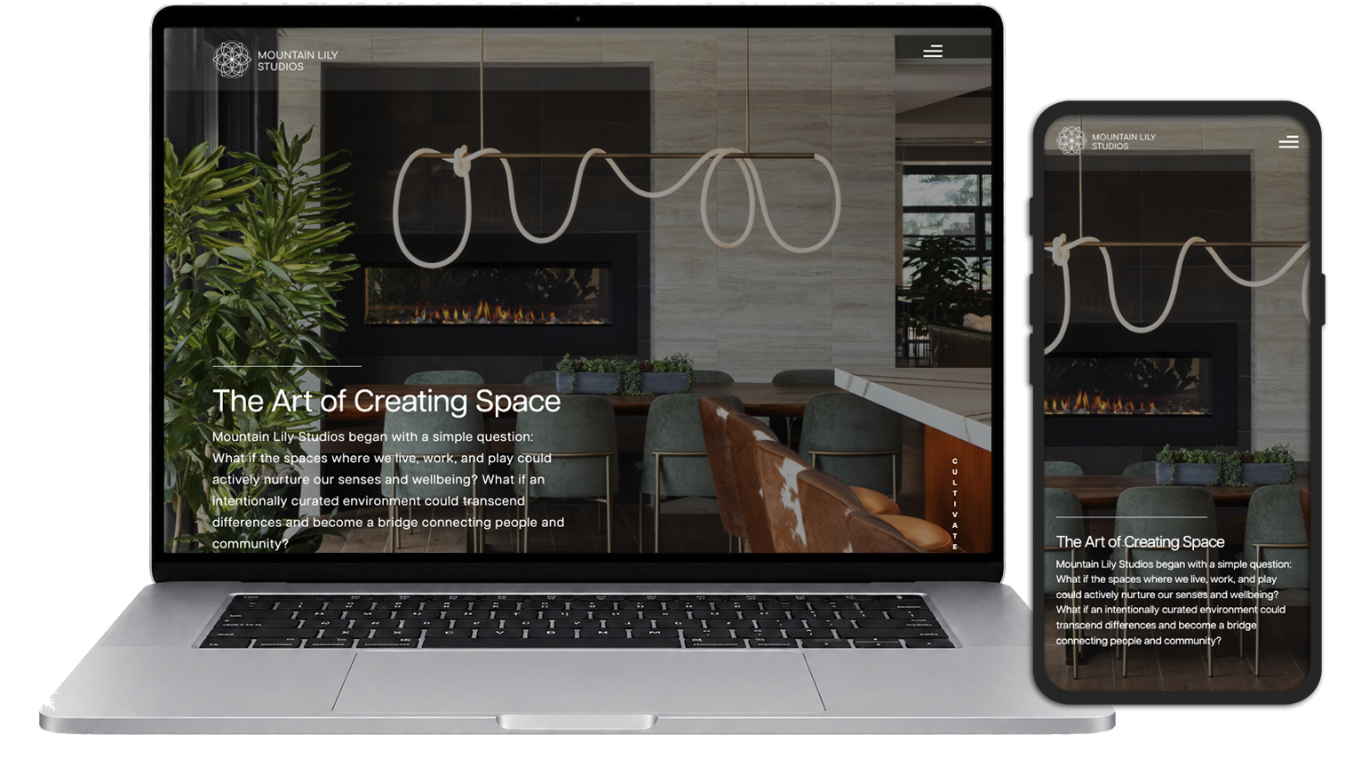
Mountain Lily Studios is a Colorado-based interior design studio focused on creating intentional spaces that foster connection, wellbeing, and a sense of belonging. Their work spans residential and commercial environments, blending natural materials, thoughtful design, and timeless aesthetics to create spaces that feel both functional and deeply human.
The Challenge
Mountain Lily Studios needed a website that reflected the quality and intentionality of their interior design work while remaining easy to manage and update. The site needed to balance immersive visual storytelling with strong performance, allowing visitors to explore projects, understand the studio’s philosophy, and connect with the brand across all devices.
Key objectives included:
- Creating a visually driven experience that showcased project photography
- Supporting flexible content management for future growth
- Maintaining fast load times despite large, high-quality imagery
- Delivering a seamless experience across desktop and mobile devices
- Preserving the studio’s clean, sophisticated aesthetic throughout the site
My Approach
I developed a custom WordPress theme tailored specifically to the needs of Mountain Lily Studios, focusing on flexibility, performance, and long-term maintainability. Using Sage 10 and Advanced Custom Fields, I created a content management experience that allows the client to easily manage projects, imagery, and page content without relying on a page builder.
My work included:
- Building a fully custom WordPress theme from the ground up
- Creating flexible content modules using Advanced Custom Fields
- Developing custom project management workflows
- Optimizing responsive image delivery and overall site performance
- Creating reusable Blade components for consistency and maintainability
- Implementing a mobile-first experience that preserves the visual impact of the design across all screen sizes
The result is a clean, scalable website that showcases the studio’s work while providing a straightforward editing experience for the client.